Design Guidelines
A framework for making software design decisions quickly and intentionally. Based on Making UX Decisions by Tommy Geoco.

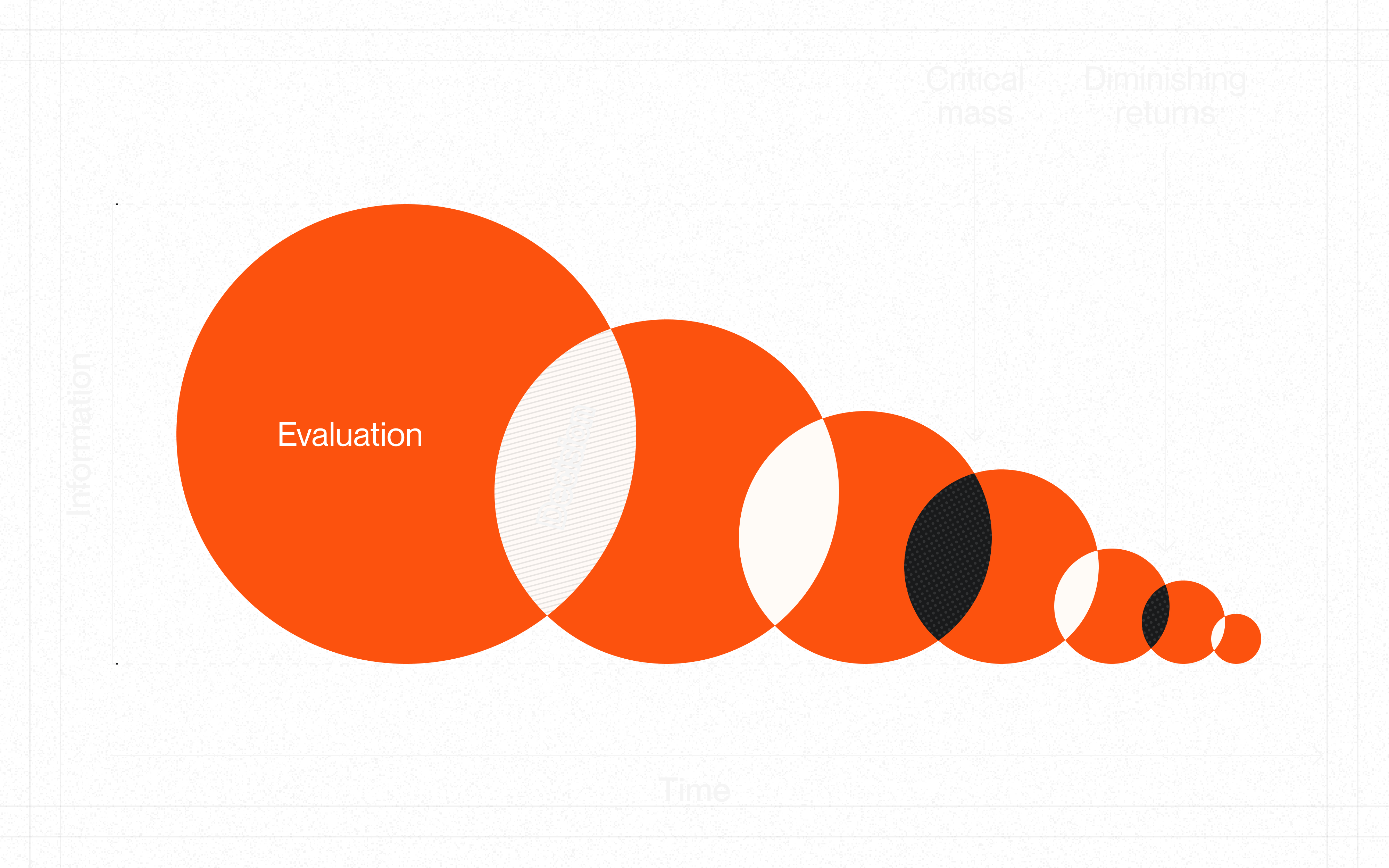
Finding Enough
Every design decision requires information, but gathering it has a cost. The chart above illustrates the relationship between information and time:
Evaluation. Early in any decision, new information has high marginal value. You're learning the constraints, stakeholders, and possibilities.
Critical Mass. At some point, you have enough to make a good decision. Not perfect—enough. This is the moment to commit.
Diminishing Returns. Beyond critical mass, each additional hour of research yields progressively less insight. The circles shrink because you're learning less while spending more.
The principle: Over-gathering kills momentum. Once you hit critical mass, more exploration is just procrastination. Recognize when you know enough, and move on.
Scaffolding
These guidelines are pre-made decisions—scaffolding you can lean on so you're not re-solving the same problems. They won't make every choice for you, but they'll eliminate the recurring ones.
Use them as defaults. When a guideline fits, take it and move on. When it doesn't, break it intentionally and document why.
Momentum > compliance.
Decisioning
- Weigh information in order.Institutional knowledge → User familiarity → Research. Check internal resources before external inspiration.
- Narrow before deciding.Eliminate what conflicts with constraints. Prioritize what aligns with macro bets.
- Align with macro bets.Every design decision should support company strategy: Velocity, Efficiency, Accuracy, or Innovation.
- Define jobs-to-be-done first."When [situation], I want to [motivation], so I can [outcome]." Focus on outcomes, not features.
- Speed ≠ recklessness.Designing quickly is not automatically reckless. The difference is intentionality.
- Build scaffolding.Automate recurring decisions with rules, defaults, and systems. Don't re-decide the same things.
Anchors
- Pursue your purpose.Connect work to larger meaning. Evaluate projects against what you love, what you're good at, what the world needs.
- Embrace the marathon mindset.Product design is a long game. Sustainable pace beats heroic bursts. Recovery is part of the work.
- Stay a beginner.Approach problems with curiosity, not assumptions. Expertise can blind you to fresh solutions.
- Own your outcomes.Take responsibility for results, not just effort. Focus on impact, not activity.
- Compound your learning.Small consistent investments in skills pay exponential returns over time.
Visual Hierarchy
- Headings are distinct from body.2:1 ratio minimum between heading levels. Weight AND size differences, not just one.
- Primary action is obvious.Users identify the main CTA within 3 seconds. One primary action per view.
- Reading flow is intentional.F-pattern for text-heavy pages. Z-pattern for landing pages. Terminal CTA at the end.
- Type scale is limited.4-5 distinct levels maximum. Display, H1, H2, Body, Caption.
- Color creates hierarchy.Reserve saturated colors for actions and emphasis. 3-4 colors max for UI elements.
- Whitespace is intentional.More space = more importance. Group related elements, separate unrelated ones.
Visual Style
- Spacing is on a scale.Base unit of 4px or 8px. Same spacing for same relationships.
- Color palette is limited.Primary, secondary, neutral, semantic (error/success/warning).
- Contrast is accessible.4.5:1 for normal text, 3:1 for large text.
- Elevation is consistent.Shadow direction consistent. Blur increases with elevation.
- Single icon style.One icon family. Consistent stroke width.
- Line heights are consistent.1.4-1.6 for body. 1.2-1.3 for headings. Never below 1.2.
- Border radius is systematic.Consistent radius scale. Nested elements use smaller radius.
Fidelity
- All states are defined.Default, hover, active, focus, disabled, loading, error, success.
- Touch targets are adequate.Minimum 44x44px on mobile, 32x32px on desktop.
- Edge cases are handled.Empty, loading, error, overflow, minimal, maximal content.
- Responsive behavior is defined.How does it work at mobile, tablet, desktop? What changes, what stays?
- Test with real content.Not lorem ipsum. Real names, real data, real edge cases.
- All interactions are specified.Click, hover, long-press, swipe, keyboard shortcuts.
Chunking
- Respect Miller's Law.7±2 items in working memory. Break complex info into digestible pieces.
- Cards contain related content.Clear boundaries, consistent structure, visual hierarchy within.
- Tabs for parallel, accordions for sequential.Tabs when users compare. Accordions when users drill down.
- Group by meaning, not convenience.Categories should match user mental models, not internal org charts.
- Show only what's needed now.Reveal complexity as users need it. Default to simple.
Information Architecture
- Location is always clear.Users know where they are, where they can go, how to get back.
- Search is available for large content.Autocomplete, recent searches, filters. Show result count.
- Filters are clear and reversible.Show active filters. Easy to clear. Indicate result counts.
- Sort options match user needs.Most useful sort first. Remember user preference.
- Pagination or infinite scroll, not both.Pagination for reference content. Infinite scroll for feeds.
Forms
- Labels above inputs.Not inside (placeholder) or to the side. Always visible.
- One column for forms.Vertical flow. Side-by-side only for related short fields (city/state).
- Validate inline.Show errors as users complete fields, not just on submit.
- Smart defaults.Pre-fill what you can. Remember previous values.
- Mark optional, not required.If most fields are required, mark the optional ones.
- Submit buttons are specific."Create Account" not "Submit". Action describes outcome.
Feedback
- Acknowledge every action.Users never wonder "did that work?"
- Loading states everywhere.Skeleton screens for content. Spinners for actions. Progress for long ops.
- Errors explain how to fix.Not just "Invalid input." What's wrong and how to resolve it.
- Errors appear near source.Inline validation next to the field. Focus the first error on submit.
- Success confirms completion.Toast, checkmark, or state change. Make completion obvious.
- Destructive actions are reversible.Soft delete, undo, or confirmation. Never instant permanent deletion.
Cognitive Load
- One primary task per screen.Don't make users think about multiple things at once.
- Recognition over recall.Show options rather than requiring memory. Autocomplete, recent items.
- Sensible defaults.Pre-select the common choice. Make the happy path obvious.
- Reduce choices.More options = more cognitive load. Curate, don't dump.
- Consistent patterns.Same action = same interaction everywhere. Don't make users relearn.
Accessibility
- Keyboard works everywhere.All flows are keyboard-operable. Follow WAI-ARIA patterns.
- Focus is always visible.Clear focus ring on every focusable element.
- Labels everywhere.Every input has a label. Icon-only buttons have aria-label.
- Color is not alone.Don't rely on color alone to convey meaning. Add text or icons.
- Zoom is respected.Never disable browser zoom. Layouts work at 200%.
- Motion is reducible.Respect prefers-reduced-motion. Essential animations only.
Onboarding
- Empty states guide.Empty screens explain what goes here and how to add it.
- First run is guided.Show users the fastest path to value. Defer setup until necessary.
- Tooltips for discovery.Introduce features progressively. Don't overwhelm.
- No dead ends.Every screen offers a next step or recovery path.
- Defer signup.Let users experience value before requiring an account.
Personalization
- Remember preferences.Theme, sort order, view mode, filters. Don't make users reset.
- Surface recent and frequent.Recently viewed, frequently used, quick access.
- Recommendations are relevant.Based on behavior, not assumptions. Easy to dismiss.
- Users control personalization.Can view, edit, reset. Transparent about what's tracked.
Innovation
- Familiar foundation, novel details.Core patterns should be recognizable. Differentiate at the edges.
- Novelty must be earned.New patterns need clear benefits. Don't be different for its own sake.
- Test novel patterns.Higher risk = more validation needed.
- Document the why.Future you won't remember why you broke convention.
Social Proof